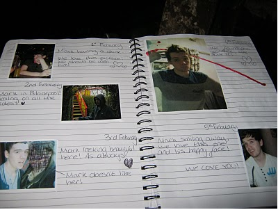
The title of our film was also the title of the diary in the film, this sums up the idea of the film which is about the female antagonists obsession with the male victim. We deliberately chose the text of the title of the book in red to be in a mismatched, jagged style, this is to show the audience that the film is disturbing. The obsessed book was also used to emphasize the female killers obsession with the male victim and to show that she has been watching him for a long time which the audience can see through the use of with different location pictures and diary dates. This would attract our target audience who are interested in psycological thriller films as this comes across as stalking and would make them think about why the female antagonist is doing this.

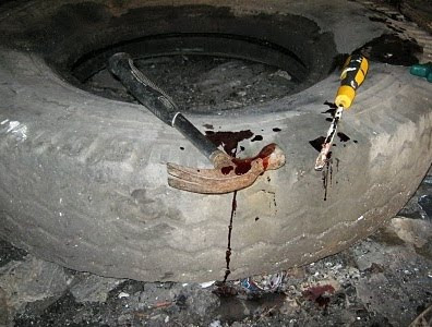
We also added fake blood to the book and to some of the props, this creates more horror and reflects our film theme. The blood also creates tension and questioning for the audience to where the blood came from, and if Mark had been injured by them. The mise en scene of the make-up on Mark also explains this, as fake blood on his face and make-up bruising reflects he has been hurt.
In the opening scene we have used a wide range of shots, sound, mise en scene and editing to attract our audience. Firstly we used mise en scene effectively to fit with the genre of the film. We used props such as different tools (eg. screw driver, hammer), a chair, the obsessed book, and the belt to show the audience somthing was wrong. We used the chair and belt to keep Mark trapped inside to create the tension we also used a pan shot of the blood-soaked tools to create create tension amongst the audience, as this shows the male victim has been harmed. The audience would want to see these types of clips as it is psycological thriller so they would expect to see this type of stuff.

The use of mise en scene for the male victims t-shirt emphasizes the state that he was kept in, with rips and blood on it, this suggests to the audience he has been pooorly treated and tortured. The use of colour of the victims white t-shirt represents purity and innocence. This compliments the character in the opening scene, as he is innocent. The costume for the character Jess also had fake blood, which was on her hands, and a black coat which was used to hide her identity. The use of colour for Jess also compliments her character, as black has connotations of death and evil. The use of all the colour directly attracts our target audience further as the negative colours will evoke an emotional response of fear and tension. To further evoke emotional responses we also used harsh diagetic sounds such as scribbling to make the audience feel uncomfortable. The sound is uncomfortable and was placed in the film to recieve a physical reation such as that a person may get when a chalkboard is scraped
We used a number of fast paced, seamlessly edited close-ups of the female antagonist cutting up photographs and scribbling out faces. This was done to make the audience think "what's going on?" and "why is she doing this?" however it becomes clear to the audience that this character is an obsessed stalker when we see her diary with various different dates and events written in it about the male character. Using the close ups of the male victim struggling adds a fear factor to the film, as he's trying to escape and the audience would be on edge watching. We used final cut pro to create the fast cut editing, we did this by editing in a variety of shots to build up the tension.
No comments:
Post a Comment